(Don't be shy! Click to enlarge the image.)
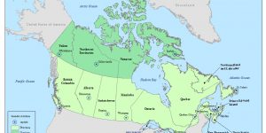
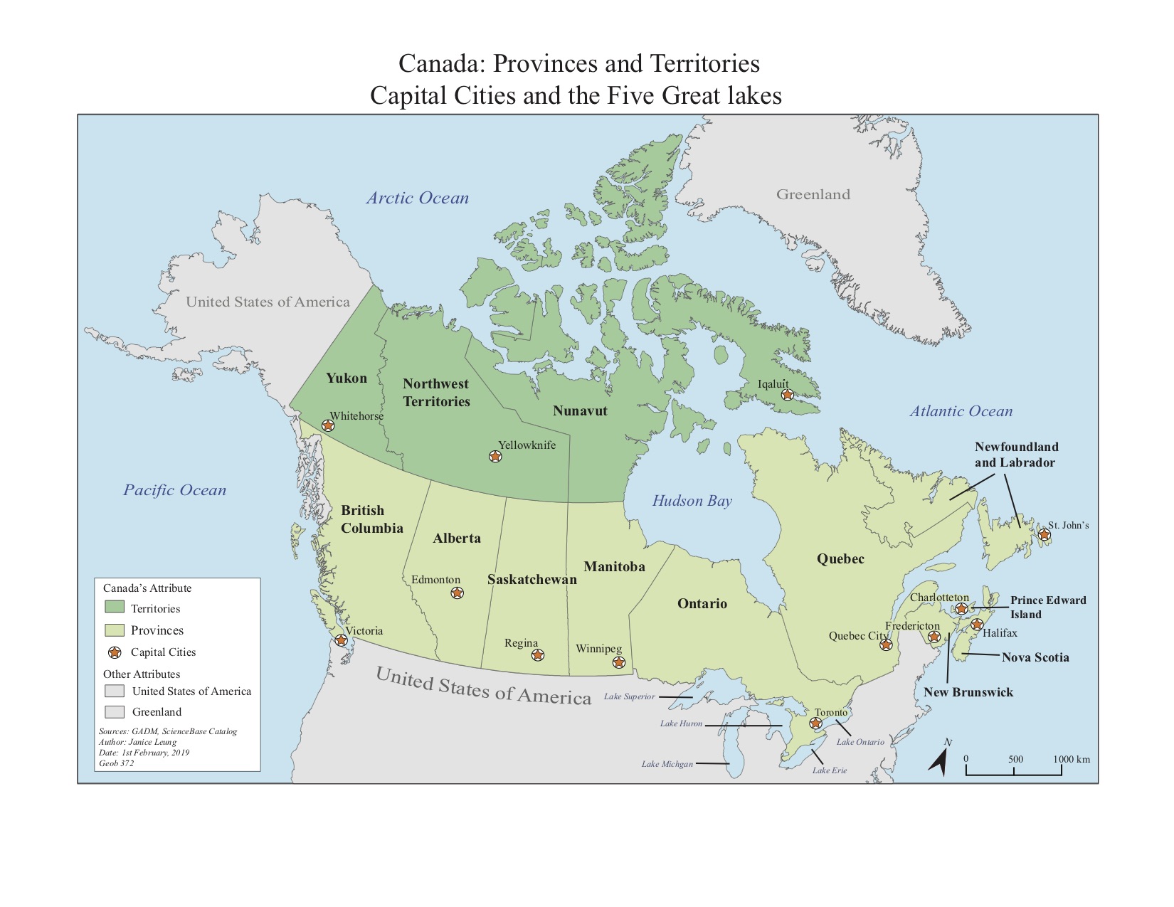
In the first week of my Cartography class, I was asked to Adobe Illustrator to create a reference map of Canada for a Grade 5 social studies textbook. In this assignment, I used point features to show different capital cities of Canada and line features to show the borders of each Canadian province.
Things I learnt through this assignment:
Labelling
- For point features, the most preferred position for labelling a point feature is at the upper right hand corner and bottom left hand corner. Try to avoid labelling right on top or above of the point feature.
- For area features, labels should mimic the feature shape and orientation. Position the label in the middle of the area feature by adjusting the kerning, spacing, size and direction of labels.
- For adding halos, border colour should be the same as the colour of the text. Adding halos helps to improve the label readability, especially words on complex background layers.
- Text size can vary to show hierarchy: cartographers can use bigger font size to show a more important piece of information (eg province names) while using a smaller font size to show a less important piece of information (eg the names of the five great lakes)
Visual Hierarchy
- Cartographers strived to place important map features more prominent on the map and less important features fade into the background through text size, colour and forms. This can help create harmony between the primary and secondary representations on the map and thus will create better quality of the map.
Learning Significance