
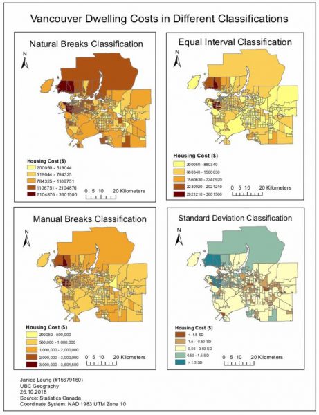
This week I have created a map of the housing affordability in Vancouver in different classification methods. While the data is the same in all maps, affordability can be represented in different ways according to how prices are grouped or classed together.
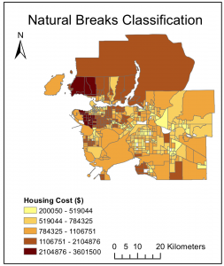
Natural Breaks Classification
The natural breaks classification method is a method which the software will classify your data naturally. It will classify the data which has a similar value and insert a “break” when there is a huge jump between the values. Natural breaks classification has the least amount of error and allows you to see a general picture of Vancouver housing prices. From the map you can see that generally Vancouver housing prices are expensive.
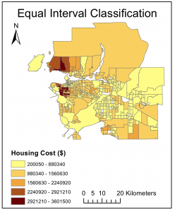
Equal Interval Classification
The equal interval classification takes the range of the data, subtracting the highest and the lowest value of the range and divides evenly into different classes. The equal interval classification method presents Vancouver housing prices as relatively affordable. Only a few of the houses are at the $2,900,000-$3,601,500 range while most houses fall onto the range $800,000 to $2,900,000. Map users will have a false view of the housing prices in Vancouver in 2016 that the houses are not expensive..
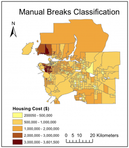
Manual Breaks Classification
The manual breaks classification method allows you to set your own class boundary and to decide how the data is to be visually presented. In this way, the data can be presented in an ethical or unethical way.
In this map, it presents that the housing costs in Vancouver are generally all expensive. There are no houses fall on the lowest class. This map conveys the message that houses in Vancouver are all of similar prices.
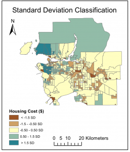
Standard Deviation Classification
The Standard Deviation classification method shows how the values are differ from the mean. It can be one to two S.D. higher than the mean, at the mean or one to two S.D. lower than the mean.
Using the standard deviation method does not provide much information of the Vancouver dwelling costs other than just comparing the values to the mean only. It is not map user friendly as not many people know what standard deviation is and could not decode the map.
Final Map with all Four Classification Methods
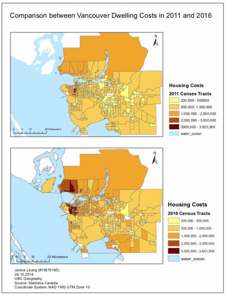
Housing Affordability 2011 vs 2016
The two maps indicate the housing prices of Metro Vancouver in 2011 and 2016 respectively. Comparing the two maps below, it clearly illustrates that there is an increase in the Vancouver shelter cost from 2011 to 2016.
In 2011, the shelter cost in Metro Vancouver mostly ranges from $500,000 to 3,000,000. However in 2016, houses in North Vancouver and west end cost over $3,000,000. Housing prices near to White Rock also increases. This demonstrates that the housing prices in Metro Vancouver are getting higher and higher. This map uses the “shelter cost-to-income ratio of private household” which is defined as the proportion of average total income of household is spent on shelter-related expenses such as electricity, heat, municipal services etc. There are some errors when using this method which will be discussed below.
Error Analysis
There are also some errors and uncertainties when using this method to make the maps. As stated above, it uses the average total income of household to make the map. However, using taking the average is not a too ideal method to calculate. Since if the data is highly skewed, ie someone spent so much money on the household expenses and someone did not spend at money on the household expenses, it will either pull up or down the average number. In this way, map users do not have a clear picture of the housing affordability in Vancouver. It will make the housing areas seem more expensive to live in while actually in the real world only a few number of people spent much of their on the household expenses.
Skills Acquired
- Spatially joined tabular data of Canadian Census 2011 income and housing cost to spatial data of census tracts to visualize census information
- Able to present the housing affordability in 4 methods of classification: natural breaks, equal interval, standard deviation and manual breaks to demonstrate that maps can manipulate meaning.
Learning Significance